ADVERTISEMENT
Matching grout color:
Works well with large-format tiles
Contrasting grout:
Adds visual interest
Light grout can brighten a room but may require more maintenance.
Dark grout hides stains but can emphasize patterns.
Matching Tile to Kitchen Style
Let’s explore how flooring choices align with popular kitchen aesthetics.
Neutral tones (white, gray, taupe)
Minimal grout contrast
Clean, understated, and sleek.
Warm beige or soft brown tones
Textured finish
Comfortable, welcoming, timeless.
Dark gray or charcoal
Minimal pattern
Urban and edgy.
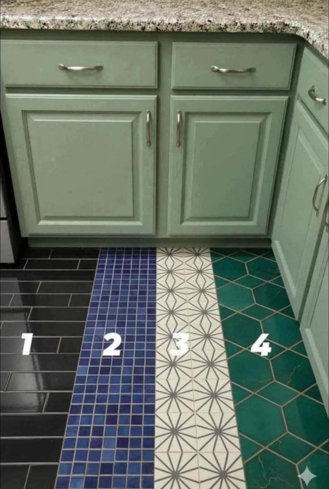
Mediterranean
Patterned ceramic tiles
Earth tones or blues
Intricate designs
Bold and expressive.
Classic Traditional
Marble-look porcelain
Neutral palette
Balanced layout
Elegant without being overpowering.
Light, Space, and Visual Illusion
Your flooring affects how large — or small — your kitchen feels.
To visually expand a kitchen:
Use lighter tones
Choose larger tiles
Run tile lengthwise in narrow spaces
To create intimacy in a large kitchen:
Use warmer tones
Consider subtle patterning
Add texture
The right floor can make a cramped kitchen breathe — or make a cavernous one feel grounded.
Practical Considerations You Shouldn’t Ignore
Durability
Choose tiles rated for high foot traffic.
Water Resistance
Spills are inevitable. Make sure the tile absorbs minimal moisture.
Ease of Cleaning
Smooth surfaces are easier to mop. Textured tiles may trap debris.
Installation Cost
Large-format and patterned tiles may require professional installation.
Longevity
Trends change. Choose something you’ll still love in 10 years.
Mistakes to Avoid
Choosing style over slip resistance
Ignoring grout color impact
Selecting overly busy patterns in small kitchens
ADVERTISEMENT
