ADVERTISEMENT
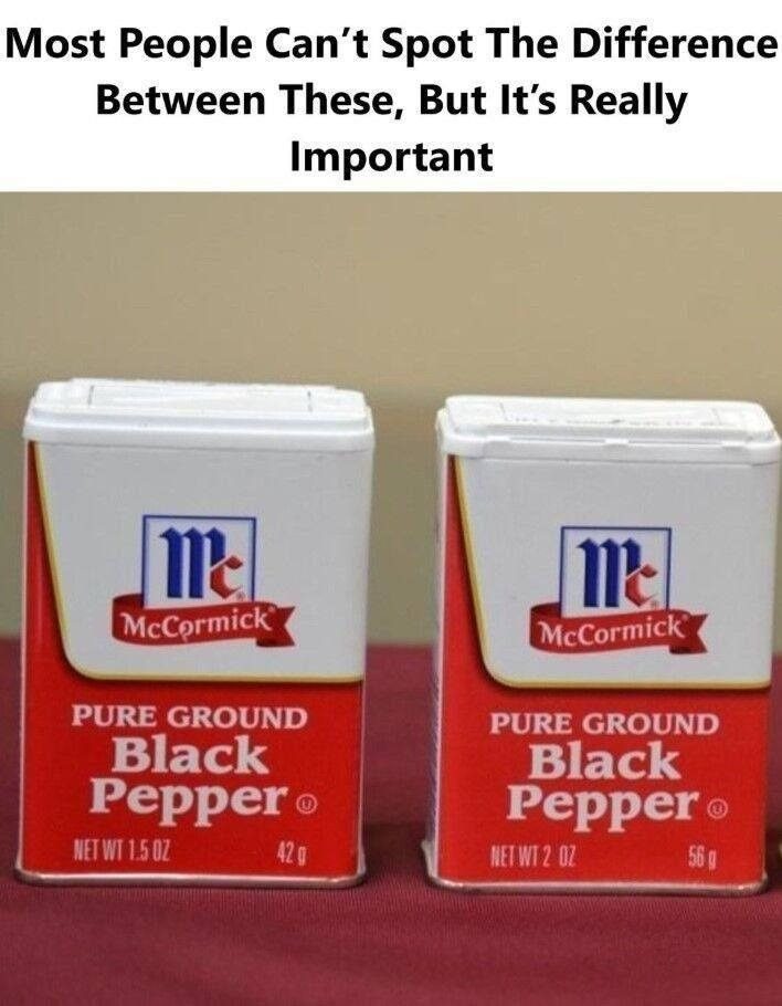
Shopping for groceries used to be straightforward. You picked up a familiar product, tossed it in your cart, and moved on. But in recent years, something has changed. The packages look the same, the brands are trusted names, yet somehow you’re getting less for your money. Welcome to the modern reality of product packaging, where appearance and contents don’t always align.
Package design exploits this reality. A taller bottle suggests more volume. A wider container implies greater quantity. Bright colors signal freshness and quality. These aren’t accidental choices—they’re deliberate strategies backed by millions of dollars in consumer research.
ADVERTISEMENT
